# Trends and Metrics
The Trends dashboard provides a quick view of synchronization activity, project configuration patterns, and failure insights across space.vars.SITENAME. Users can monitor sync volume, identify high- or low-activity areas, track project growth across systems, and drill down into specific systems, integrations, projects, and entity types for deeper analysis.
## Trends & Metrics View
* Login into space.vars.SITENAME.
* Navigate to Metrics and Trends Dashboard on the home page
## Metrics
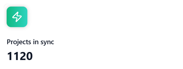
### Projects in sync
Shows the total number of configured projects including child projects in space.vars.SITENAME across all integrated systems.
Note: Child projects are not included in the count if the integration that contains child projects is not activated at least once.
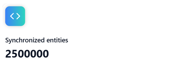
### Entities synchronized
Shows the total number of entities synchronized by space.vars.SITENAME across all integrated systems.
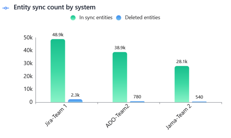
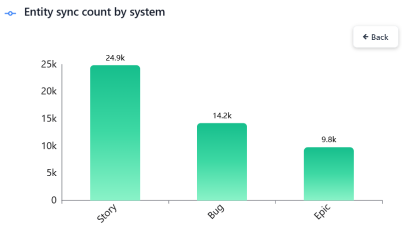
### Entity sync count by system
Displays the total count of entities synchronized by space.vars.SITENAME across all systems, including both in-sync and deleted entities.
* In sync entities include all active entities that are currently part of the synchronization.
* Deleted entities include all entities that have been deleted, archived, or deprecated - including entities deprecated due to project conversion, entity conversion, or both.
Click a bar to view the entity-type breakdown for the selected system.
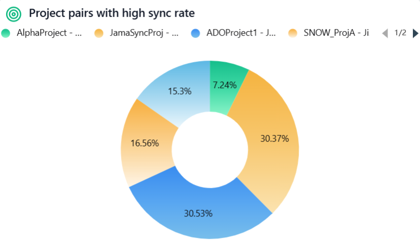
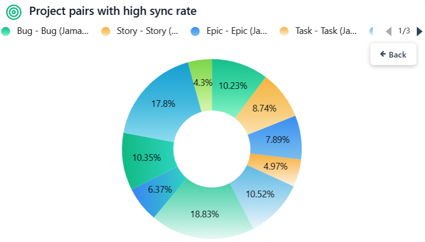
### Project pairs with high sync rate
Shows the top 10 project pairs with the highest synchronization activity, helping teams quickly identify the most active integrations, focus monitoring and optimization efforts on critical data flows.
Click a pie slice to view the entity-type pair breakdown for the selected project pair.
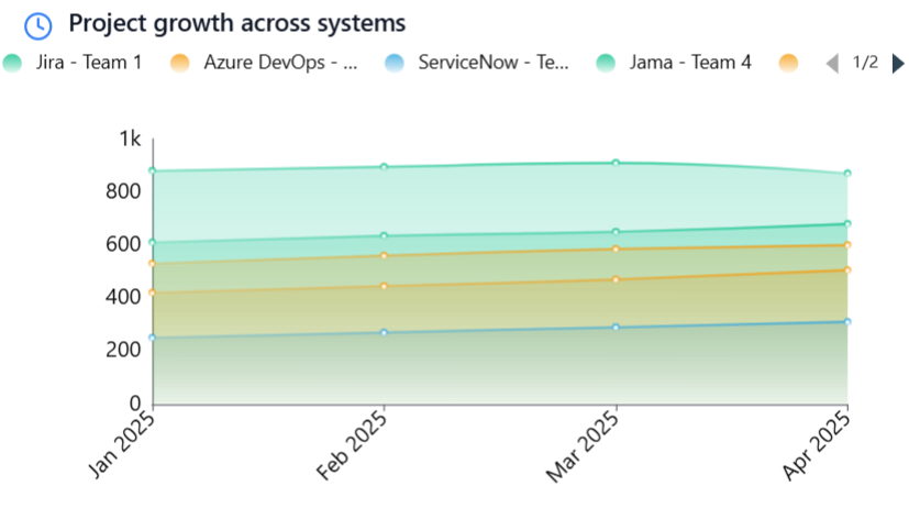
### Project growth across systems
Displays project growth trends per system over time, helping teams understand adoption patterns, compare system usage, and identify periods of rapid growth or stagnation for better planning and decision-making.
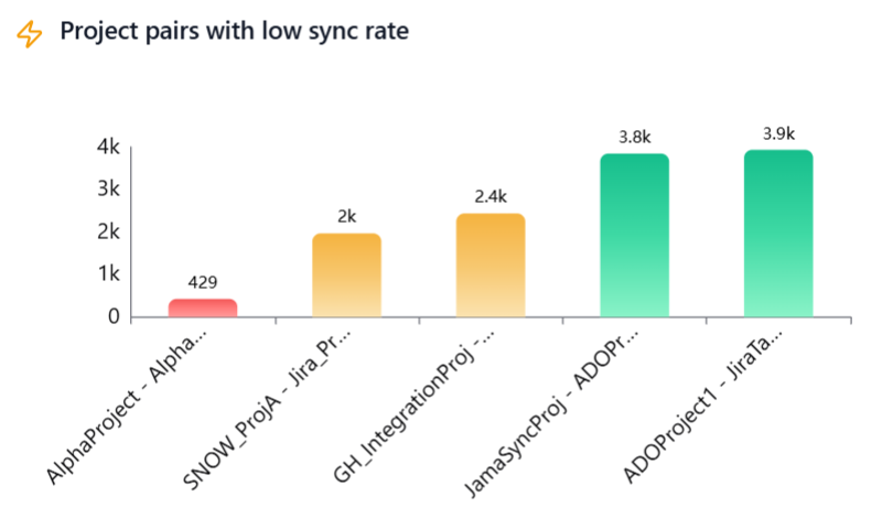
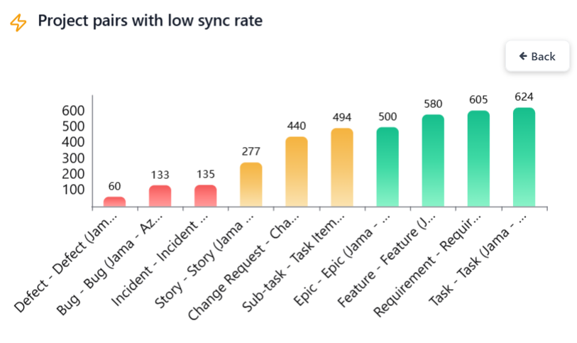
### Project pairs with low sync rate
Highlights project pairs with low synchronization activity, drawing attention to possible issues such as sync failures, misconfiguration, decommissioned projects, or candidates for archival or cleanup, enabling timely investigation and corrective action.
Click a bar to view the entity-type pair breakdown for the selected project pair.
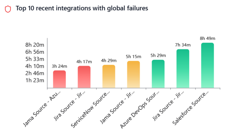
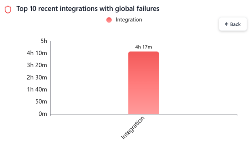
### Top 10 recent integrations with global failures
Displays the top 10 most recent integrations with active global failures, helping teams quickly spot critical issues and take prompt action for sync stability.
Click a bar to view the job-level breakdown, including integration, and delete jobs.
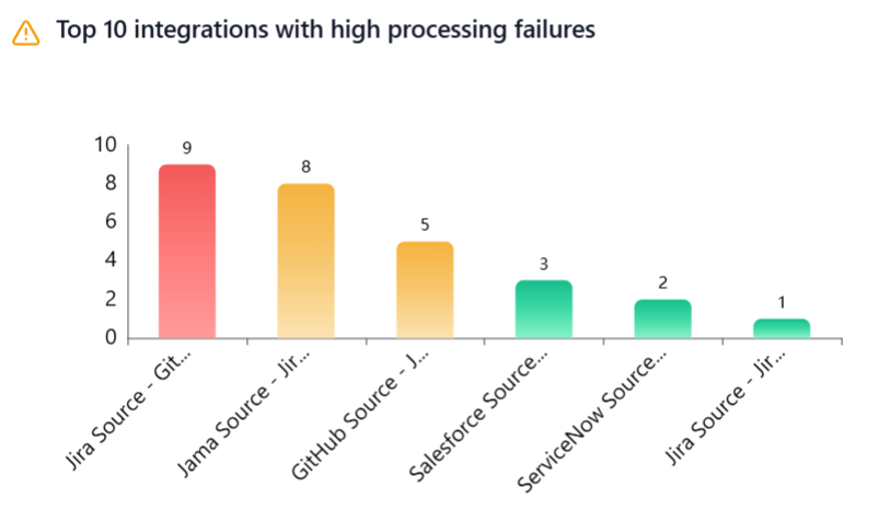
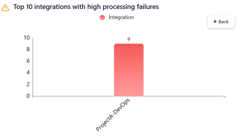
### Top 10 integrations with high processing failures
Displays the top 10 most recent integrations experiencing processing failures, helping teams quickly identify integrations with such failures, understand failure impact, and prioritize investigation
Click a bar to view the project-wise breakdown.
## Filtering the Dashboard
> **Note**: All charts display data associated with the currently selected folder, including its child folders. To view data across all folders, select the Default Folder. You can also select any other folder that you have access to.
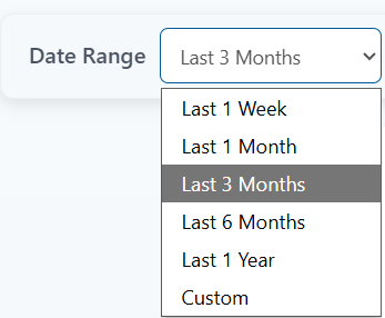
### Date Range
Select the date range to filter metrics.
Predefined options include – Last 1 Week, Last 1 Month, Last 3 Months, Last 6 Months and Last 1 Year.
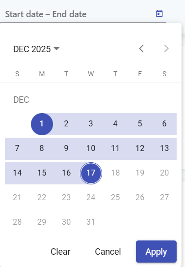
For a custom range, choose Custom option and select the start and end dates.
To ensure optimal performance and system reliability, chart data is aggregated at different granularities based on the selected date range.
* Daily granularity is applied when the selected date range is within the last 3 months.
* Monthly granularity is applied when the selected date range extends beyond 3 months and up to 3 years.
* Yearly granularity is applied when the selected date range extends beyond the last 3 years.
Examples:
Assume today’s date is 22 Dec 2025.
#### Example 1
Selected date range: 09 Jan 2024 - 22 Dec 2025 Since this date range extends beyond the last 3 months but is within 3 years, monthly granularity is applied.
Data is displayed using the following actual date range: 01 Jan 2024 - 22 Dec 2025
#### Example 2
Selected date range: 14 Mar 2006 - 22 Mar 2006 Since this date range extends beyond the last 3 years, yearly granularity is applied.
Data is displayed using the following actual date range: 01 Jan 2006 - 31 Dec 2006
### Filter options
Click the funnel icon to view the filter options.
#### Systems
Filter metrics by selected systems (primary filter). Other filters (integrations, projects, entity types) will remain disabled. They can be applied only after the primary filter is selected.
#### Integrations
Filter metrics by selected integrations.
#### Projects
Filter metrics by selected projects. Projects can be chosen independently. If integrations are selected, only their associated projects will be available.
#### Entity types
Filter metrics by selected entity types. Entity types can be chosen independently. If integrations are selected, only their associated entity types will be available.
#### Include from child folders
Enables including items from child folders in metrics. This option is enabled by default.
* Click **Apply** to filter metrics based on the selected options.
* Click **Clear** to remove all applied filters.
## Chart data refresh
Chart data is automatically refreshed every 12 hours to ensure optimal performance and overall system reliability.
Click the refresh icon to update the chart with the latest data.
## Export
The Export feature allows you to download chart data in a single Excel file, making it easy to analyze, share, and present insights.
* For each chart, both aggregated data and raw data are included in the same Excel file, organized into separate sheets for clarity.
* The exported Excel file is automatically saved to the Downloads folder and can be shared with anyone, such as management, stakeholders, or external teams, for reporting and decision-making.
### Raw Data Limit
* To keep export operations fast and system performance optimal, raw data is limited to the top 10,000 records per chart.
* Raw data is primarily intended for debugging and deeper analysis.
* If more focused data is required, you can fine-tune the export using filters to narrow down the dataset.
Click the Export charts button to download the raw and aggregated chart data as an Excel file (packaged in a ZIP format).
---
# Agent Instructions: Querying This Documentation
If you need additional information that is not directly available in this page, you can query the documentation dynamically by asking a question.
Perform an HTTP GET request on the current page URL with the `ask` query parameter:
```
GET https://docs.opshub.com/upcoming-release/integrate/monitoring/trends-and-metrics.md?ask=
```
The question should be specific, self-contained, and written in natural language.
The response will contain a direct answer to the question and relevant excerpts and sources from the documentation.
Use this mechanism when the answer is not explicitly present in the current page, you need clarification or additional context, or you want to retrieve related documentation sections.